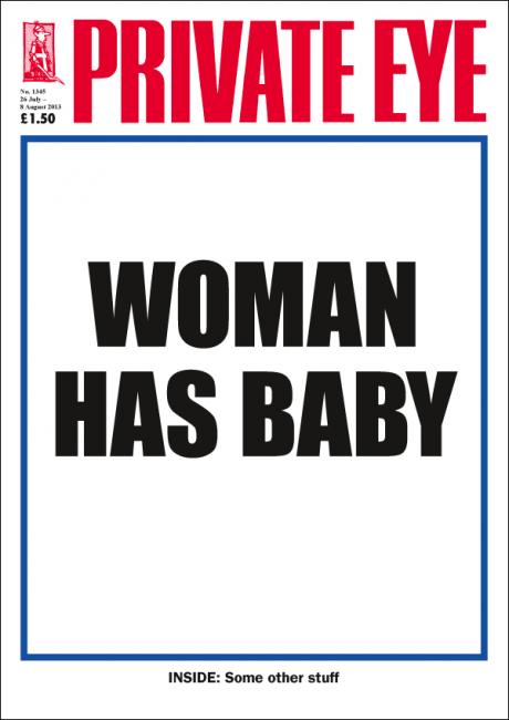
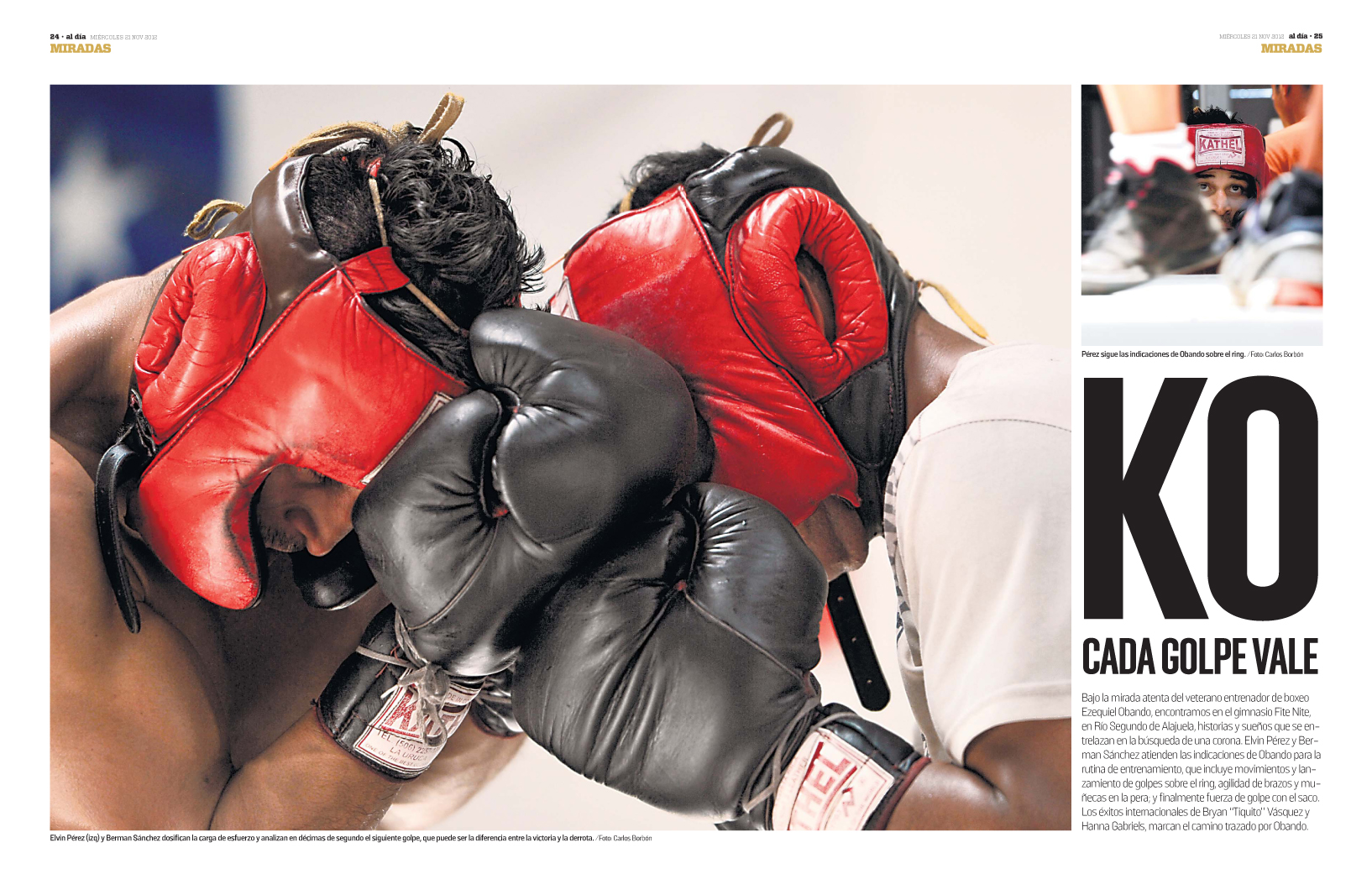
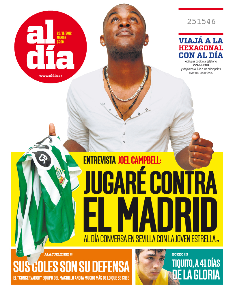
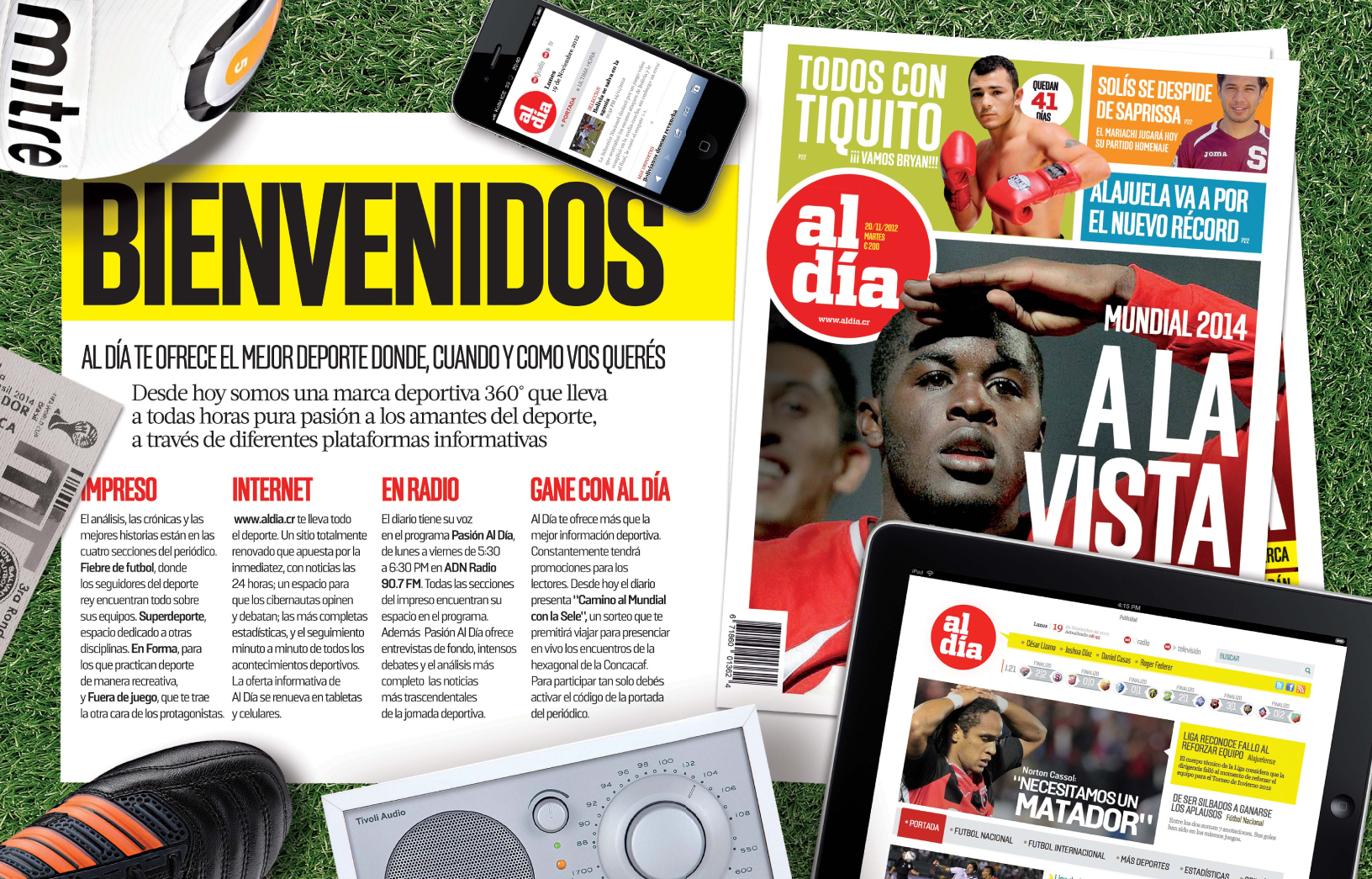
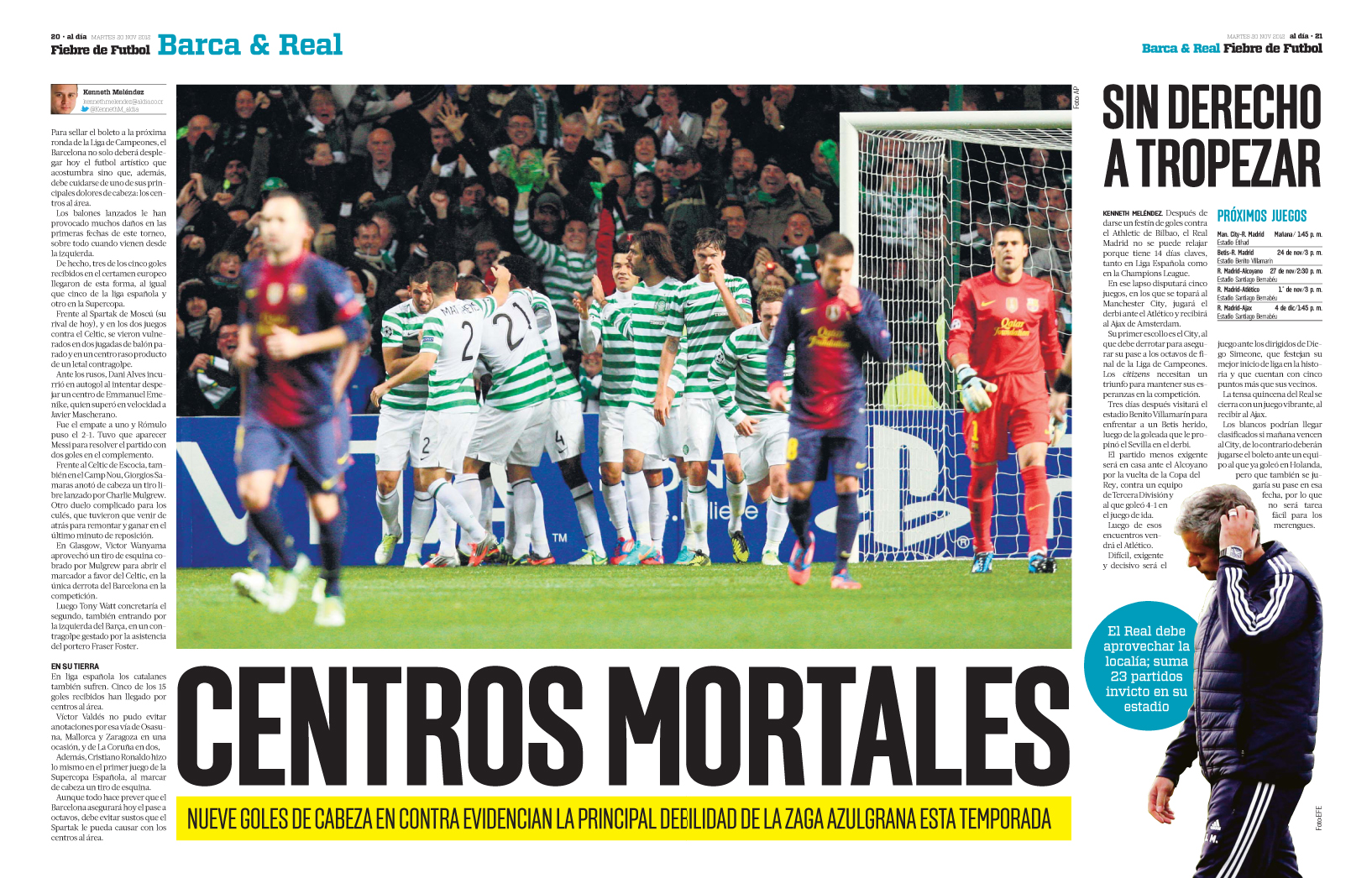
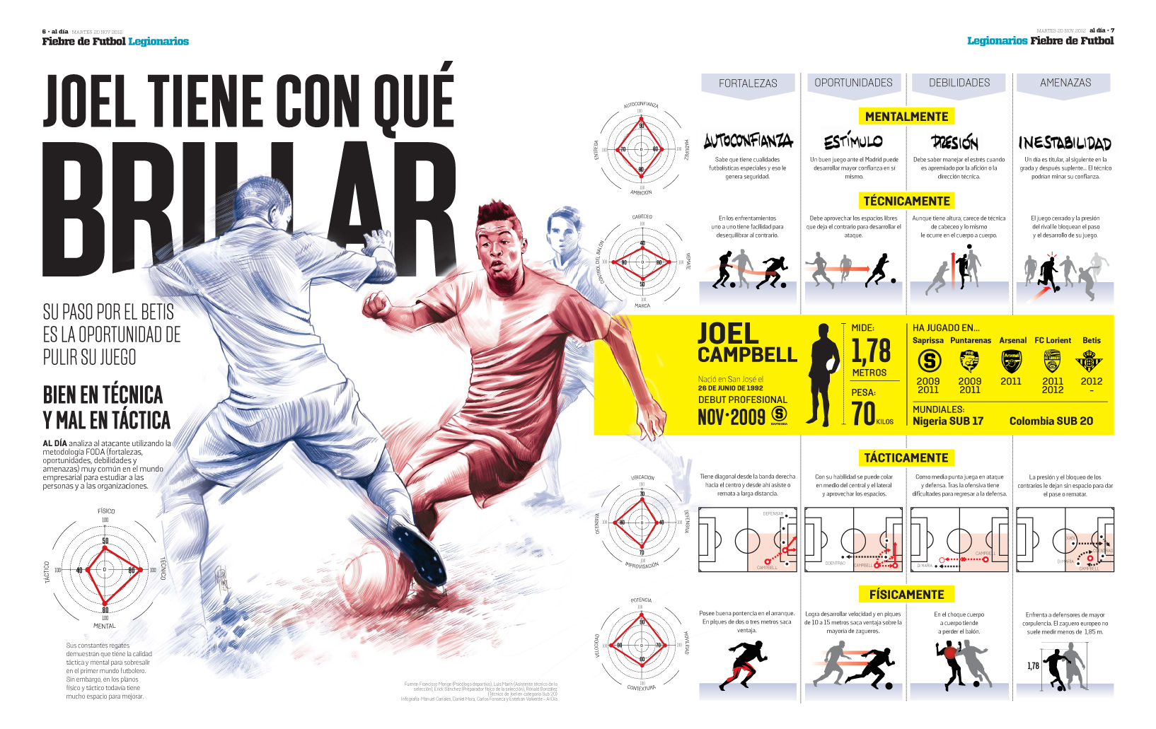
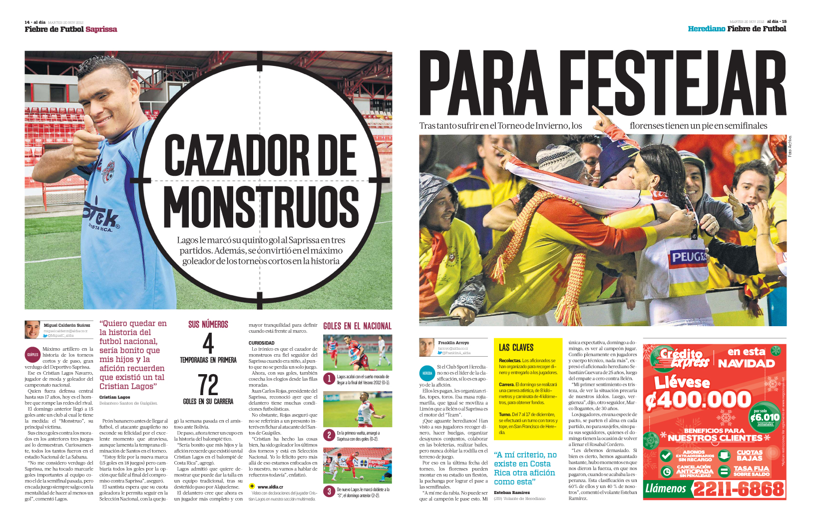
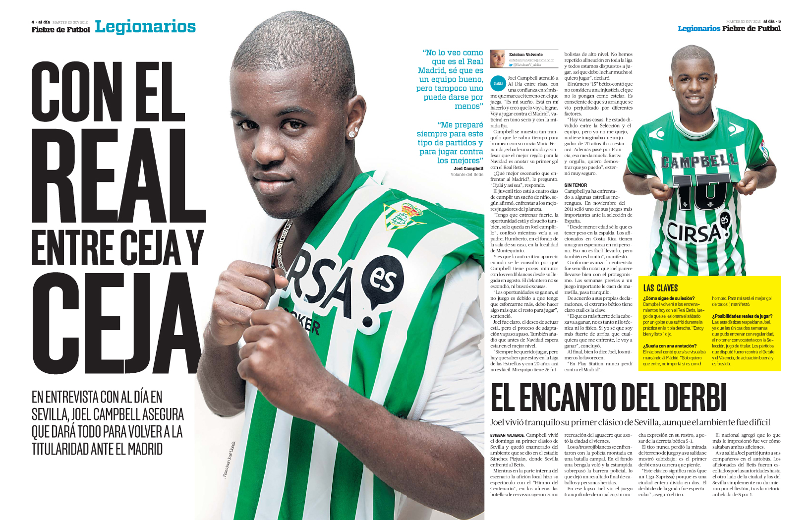
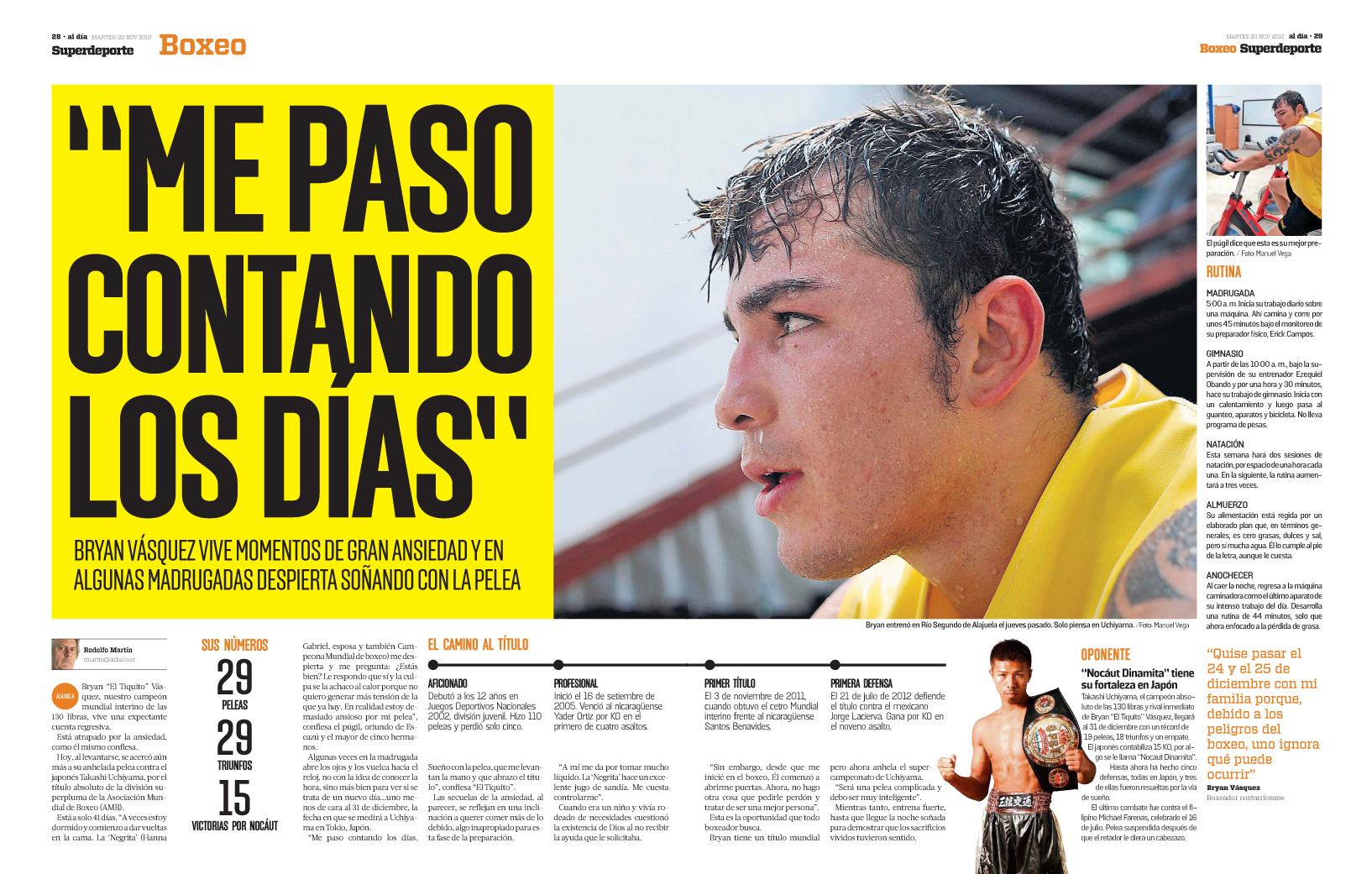
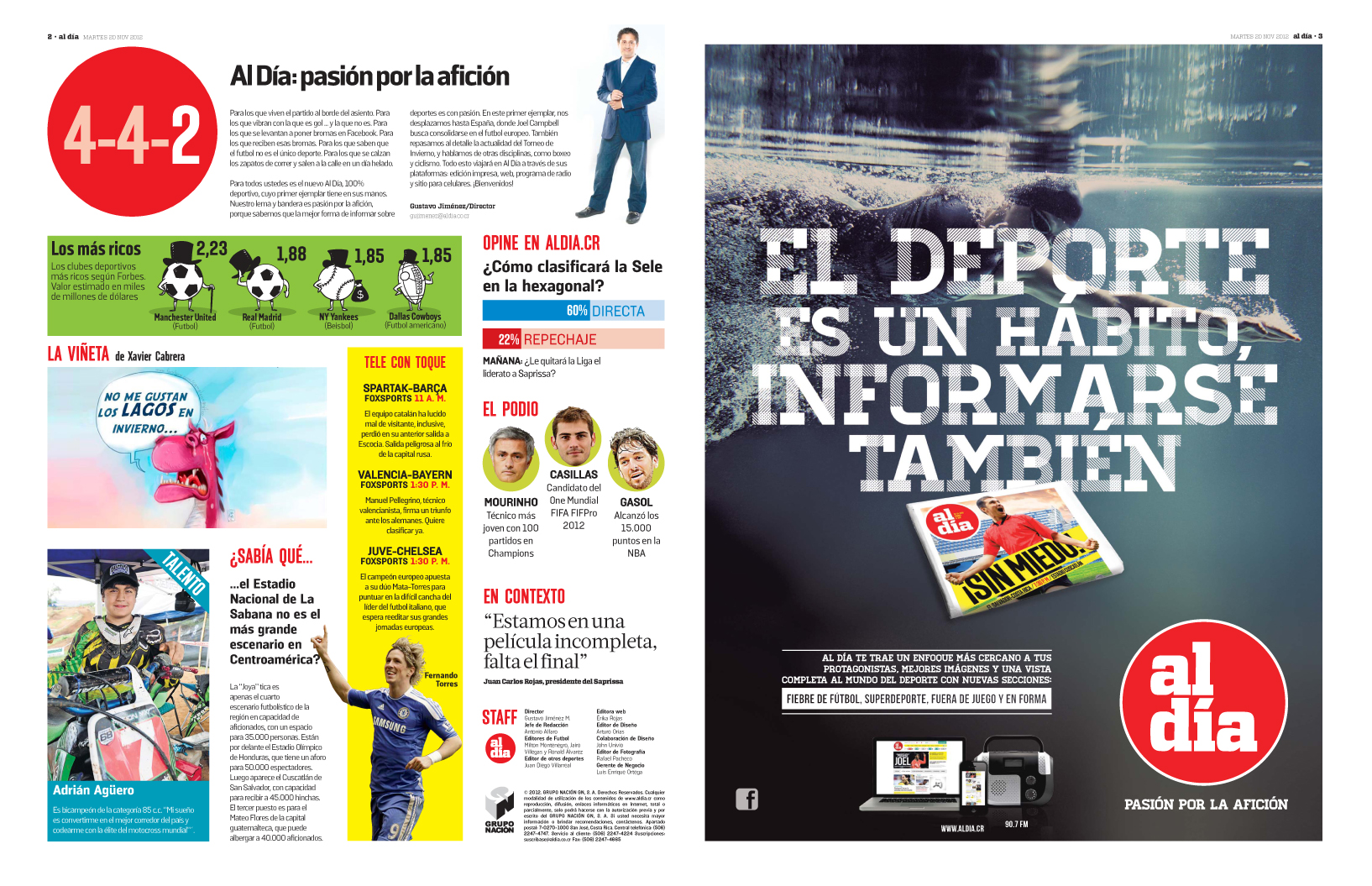
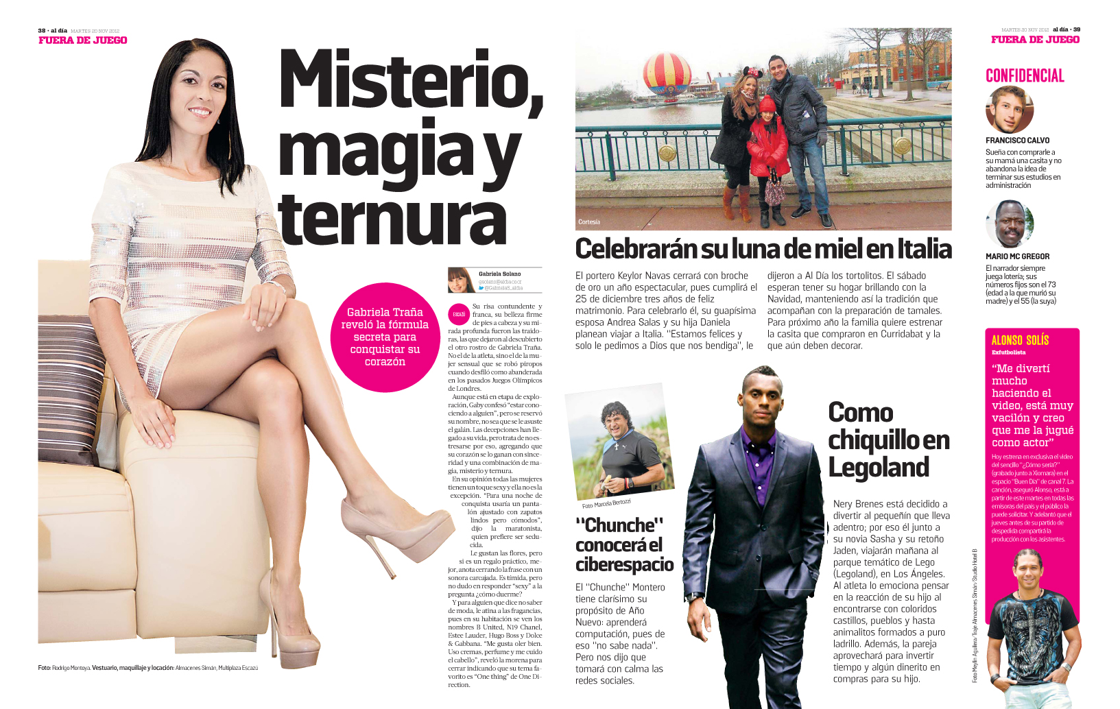
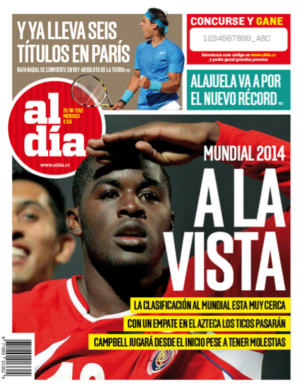
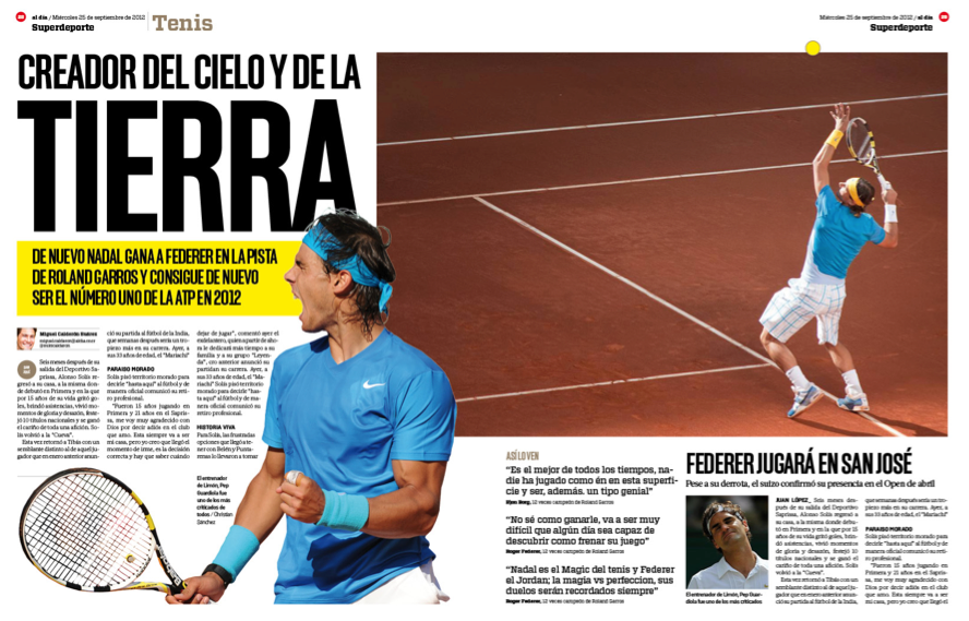
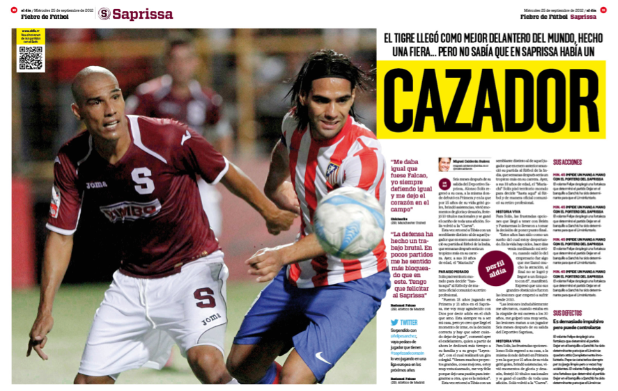
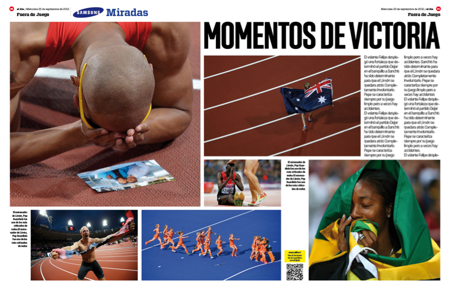
Yes, as with so many things in life, great magazine covers are difficult to explain… but you know one when you see one!
Therefore, the following is an admittedly subjective selection of some of the most creative magazine covers of 2013.
To make this selection I presented more than 100 covers to a group of seven experts (*) in five countries. After their (often conflicting) comments and choices, I alone selected the final list of 38 great covers of 2013.
The 38 covers are presented with no order as this is NOT a ranking but just a sample of how much creativity is in this business.
As you will see, “great covers” can be very different, but all share the same WOW factor.
One of the experts, former FIPP chairman and member of the board of Editora Abril, Thomaz Souto Corrêa, explained his formula for a successful magazine cover: “I don’t like easy tricks: collage with trimmed images or copies from old covers. I look for a strong image, very different from what you see on that kind of magazine, or a simple, obvious solution, that no one else sees; and preferably with cover lines easy to read, delivering messages as strong as the cover.”
Another expert, The Economist’s Intelligence Life editor Tim de Lisle, added his two pence: “The worst covers were the standard celebrity ones, with dull waxy faces and nothing to say. Especially when they were for subscribers only — a magazine should have one cover and not keep its best work for one sector of the readership at the expense of another.”
And former Hachette Filipacchi /Spain VP Juan Caño posited: Great covers must always «impact, appeal, surprise, move, inspire, hook, convince, explain, be funny, and sell.»
It’s not easy, but your cover is your most powerful marketing tool, including any viral marketing that adds extra visibility and buzz to your publication.
New York Times Magazine assistant editor Lauren Kern agrees: “Having people talk about your magazine cover is a good thing.”
Remember the advice of one editor who, when asked why she published poster style covers with huge headlines when 95 per cent of her readers were subscribers, replied: “Because I need to scream ‘Read Me!’ to them, not on the street, but on their desks, because they are busy!»
Thanks to my colleagues and friends, including INNOVATION’s John Wilpers for the editing of this introduction.
And enjoy the show!
*The “expert panel”: Thomaz Souto Corrêa in Sao Paulo, former FIPP chairman and member of the board of Editora Abril in Brazil; Tim de Lisle in London, editor of The Economist’s “Intelligent Life”; Rodrigo Sanchez in Madrid, creative director of Metrópoli; Juan Caño in Madrid, former vice president of Hachette Filipacchi in Spain; and three Innovation Media Consulting design consultants: Antonio Martín in Madrid, Vasco Ferreira in Lisbon, and Spiros Polikandriotis in Athens.

